Blakeburg in Rotterdam stands as a concrete counterpoint to the city’s famous glass towers and headline architecture—bold, heavy, and unmistakably brutalist. This photograph looks up into that world—where brutalism turns the everyday office block into a sculptural landmark, and where a single street corner can feel like a canyon of stone.
Blakeburg and Rotterdam’s Brutalist Legacy
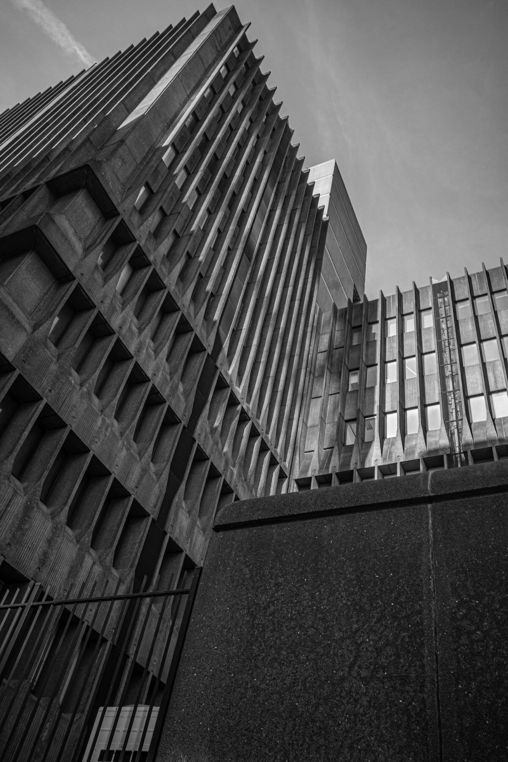
This image was made at Blakeburg, a brutalist building near Blaak in central Rotterdam, within easy walking distance of the Markthal area. To find a similar viewpoint, circle the building until you reach the most fortress-like facade—defined by deep concrete recesses, narrow window slots, and strong vertical ribs.
For the shot, keep it simple and physical:
- Get low near the sidewalk edge or behind a railing line.
- Aim upward so the facade rises diagonally into open sky.
- Let the concrete grid do the work—fill the frame with pattern, texture, and weight.
This approach turns a functional building into a graphic subject with real presence.

Rotterdam’s Late-Modern Confidence
Blakeburg was completed in 1977, during a period when Rotterdam was still actively reshaping itself after the wartime destruction and postwar rebuilding. The city’s architectural mood was bold and pragmatic: buildings needed to be durable, efficient, and unmistakably modern.
Blakeburg reflects that moment perfectly. Instead of transparency and lightness, it opts for mass and permanence—more bastion than “glass box.” Its facade feels carved rather than assembled, with repetitive modules that read like an engineered pattern. Rotterdam’s identity is often linked to constant change, but structures like this reveal another truth: the city also has a tradition of serious, uncompromising design that doesn’t ask to be liked.

Brutalism: More Than “Concrete Architecture”
Brutalism is often reduced to a stereotype—cold, grey, severe. In reality, it’s a design language built on clarity:
- Honest materials (what you see is what the building is made of)
- Exposed structure and legible construction
- Strong rhythm through repetition and modular grids
- Drama through shadow, not ornament
Blakeburg speaks fluent brutalism. The facade’s depth creates pockets of darkness that shift throughout the day, and the vertical lines give the building lift despite its weight. In Rotterdam’s climate—windy, bright one moment, overcast the next—this kind of architecture changes character constantly. The building doesn’t rely on color; it relies on form.

A Building That Divides Opinions—And Why That Matters
Buildings like Blakeburg often sit at the center of debate: some people see them as harsh, others as iconic. That tension is part of why brutalist architecture has become increasingly valued by photographers, designers, and heritage-minded locals.
Rotterdam’s story isn’t only written in the newest skyline additions. It’s also written in late-20th-century structures that capture a specific idea of progress—one built on strength, systems, and permanence. Preserving these buildings (or at least documenting them seriously) protects a chapter of the city’s architectural vocabulary that cannot be replaced once it’s gone.

Photographing Blakeburg: Texture, Scale, and Timing
This is a location where light and perspective matter more than almost anything else. The building is already dramatic—your job is to emphasize what it’s best at: depth and repetition.
Lens choices that work well here:
- Wide (around 24–35mm full-frame equivalent): exaggerates height and makes the facade feel towering.
- Normal (around 50mm): compresses the pattern and creates a more abstract, graphic look.
When to shoot:
- Early or late daylight: shadows sharpen and the facade looks carved.
- Overcast weather: contrast softens and the building reads as one heavy, continuous mass.
Add a human element:
Wait for a cyclist, pedestrian, or passing figure at the base of the frame.
Even a small silhouette instantly translates the scale from “large” to “monumental.”
Black-and-white suits this subject especially well because the building is fundamentally about tone and structure: bright edges, dark recesses, and the gritty surface of concrete.

When photographing brutalist architecture, expose for the highlights and protect texture. Concrete can hold beautiful detail—fine grain, stains, seams, and weathering—but those details disappear if you push contrast too hard.
Try this practical workflow:
- Keep your highlights safe (watch bright sky and facade edges).
- Let shadows go deep, but not empty.
- Use one clear scale cue—a person, a railing, a door—to make the building’s size readable at a glance.